Field Research
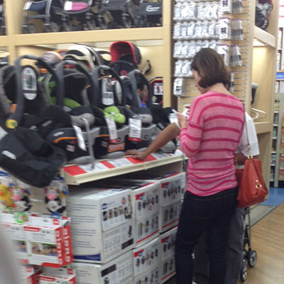
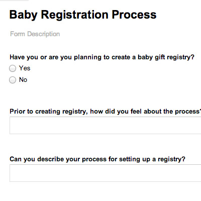
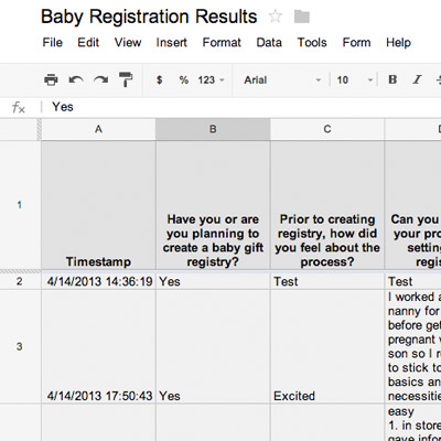
We conducted field research at a popular baby store as well as two surveys on major baby message boards. At the store we observed shopping behaviors and talked to store managers for their insight. We composed a few different surveys — the first one was a mix of quantitative and qualitative questions. Because we were a discovery phase we followed up with a second survey that was entirely qualitative. The survey results gave us some valuable preliminary data to start coming up with a solution to improve the baby registration process.

Affinity Diagrams
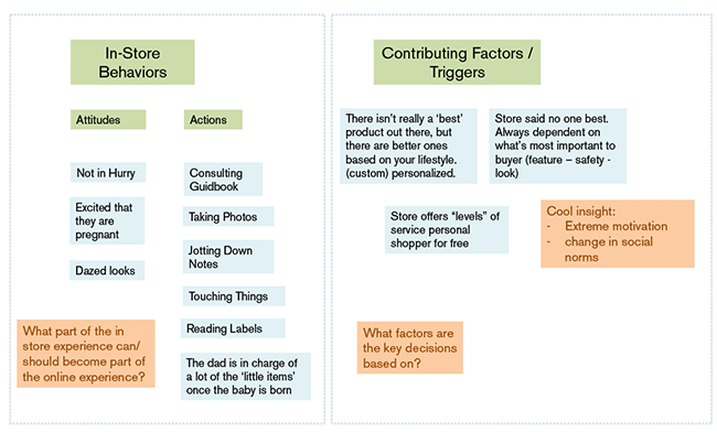
Based on our research data, we started on affinity diagrams. This process involved us gathering all of our insights onto post-it notes and then organizing them into groups. We started looking at different ways to associate these insights with each other and started to label the patterns occuring.
Personas
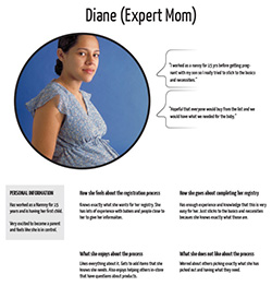
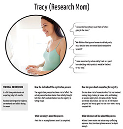
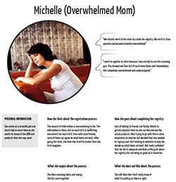
The affinity diagrams led directly into the creation of personas. Creating different personas was helpful for focusing in on a solution where we could have the most impact. The 'Overwhelmed Mom' persona was in the most need of a solution.
Wireframing
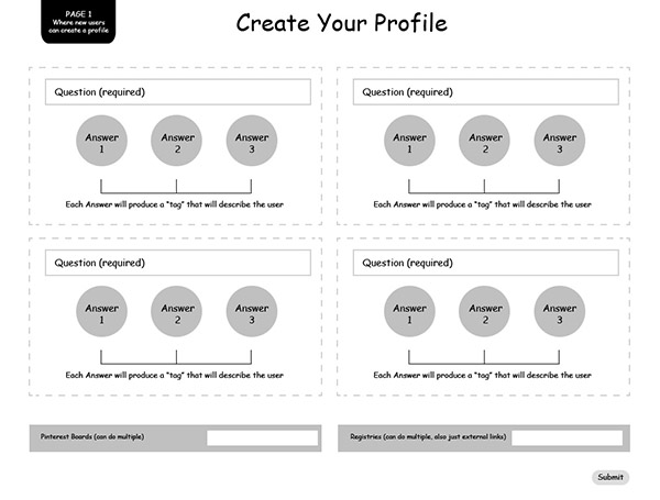
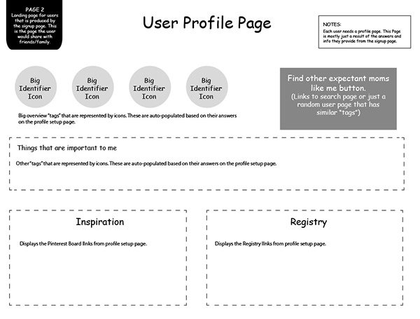
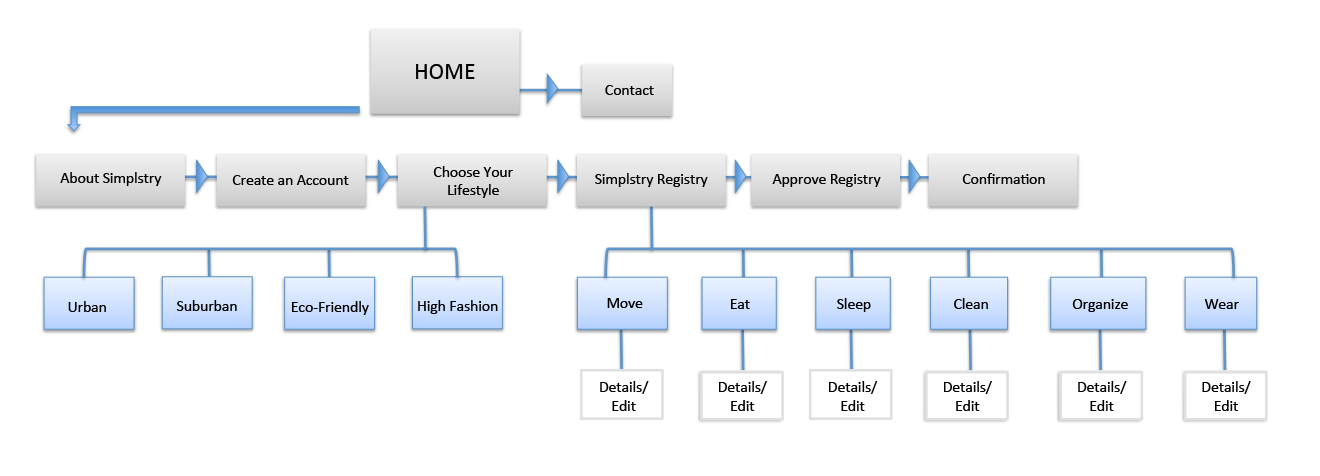
We created low-fidelity mockups as we started focusing in on different solutions. these mockups helped us test our idea and see how it could work for a user. We used a few different programs including Balsamiq and Illustrator. As we go closer to a final solution, we tested some of the wireframes in browser by creating responsive frameworks using Twitter Bootstrap.
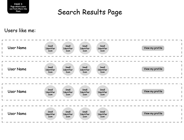
User Flows
Next we needed to think about the how the user would interact with our product. We used User Flows to diagram the steps the user would take through the site. This helped us in our next step with creating the Site Map and User Stories.
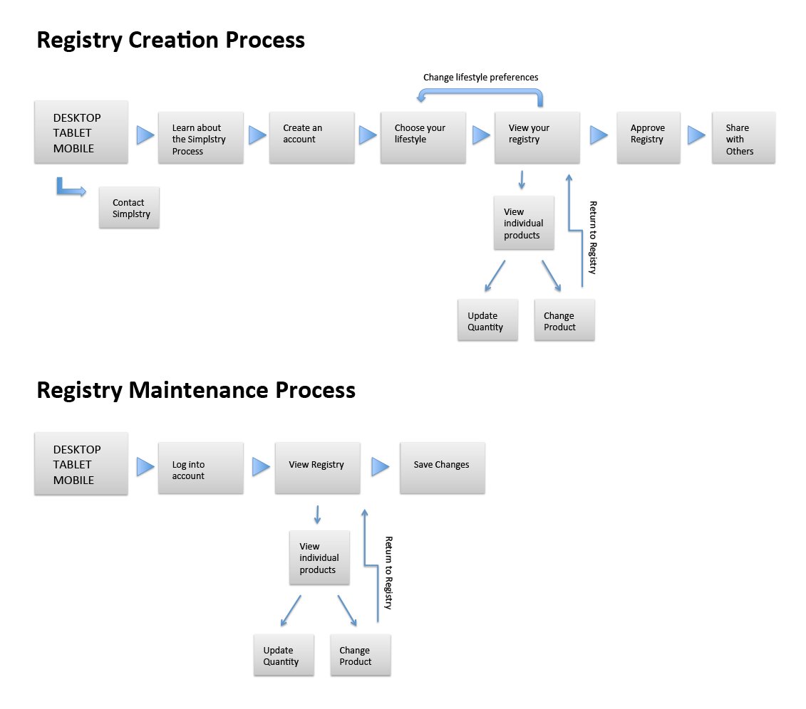
Site Map
A Site Map was developed to document the pages and categories that would be needed for the final buildout of the MVP. The Site Map helped the team keep track of the different tasks and clearly mark the heirarchy of the site.
User Stories
User Stories were an important tool for our group. Their primary use wass helping us keep track of the tasks that were to be performed on each page. This helped us manage the scope of our project and not overlook small details that could be more difficult than we assumed. With the Ruby developer on our team, it helped us communicate what we had evisioned. User stories were ranked in order of importance so that when we decided on the vital specs for our Minimal Viable Product, the low ranking elements were the first to be cut.
As a user I want to create an account.
As a user I want to answer questions that produce answers which describe my personal preferences.
As a user I want the results of this page to create a profile page that display the results.
High-Fidelity Prototype
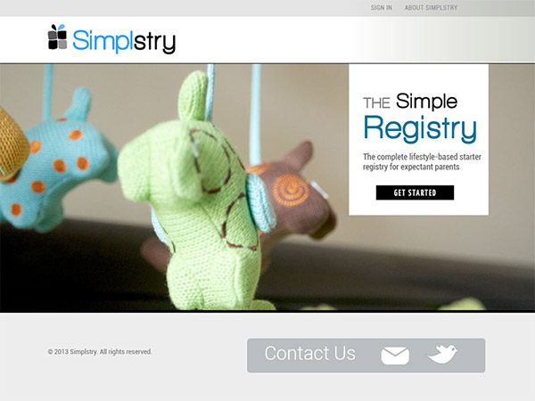
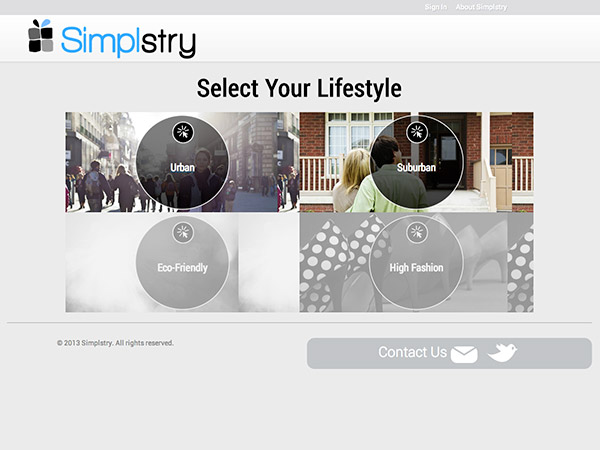
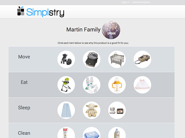
The last step we had to complete before launch of the MVP was high-fidelity prototypes. In this phase, I created the branding for Simplstry as well as the static web layouts. Once we had these aspects finalized, the assets were prepared for web and applied to the responsive Twitter Bootstrap framework.
