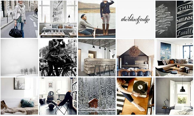
This identity project started with a mood board consisting of samples of photography and type that Lauren chose. The samples reflected a feel that she thought matched her personal taste and the overall feel that she wanted in her logo.
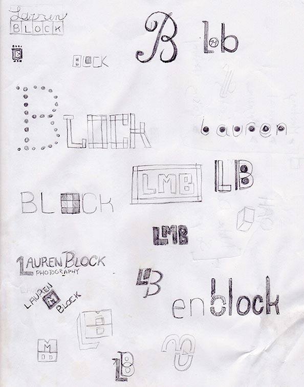
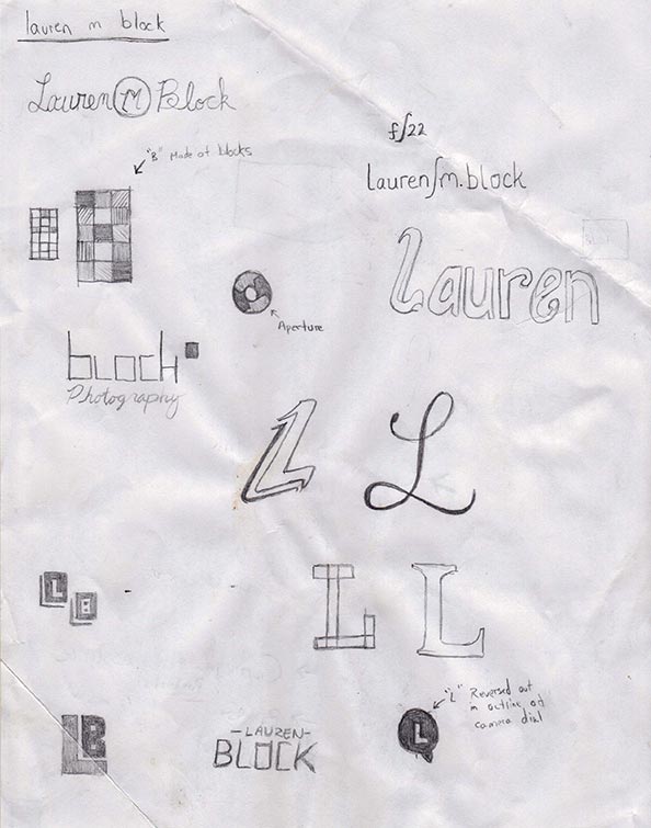
The first thing I did for this project was starting on some initial concept work. Sketching was a great way to start and allowed me to focus on how the letters fit together and different ways of combining them.
Based on the exploratory sketches, I created elements into vector graphics to see how they would translate to Illustrator. In this stage I also referred back to the mood board and chose fonts that reflected the desired feel.
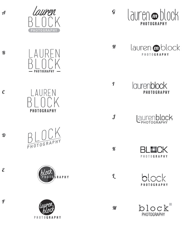
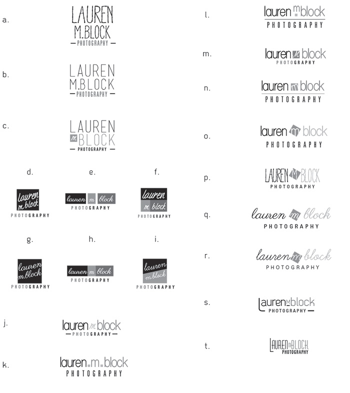
In the second round of logo options, I focused in on a few selected logos. In these versions we explored some smaller details and how the variations affected overall logo.
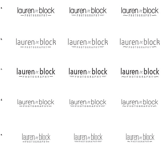
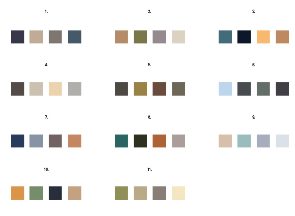
The third round focused in even further on smaller details and different font choices. At this point I also set up color pallette options that relected the feel of the mood board samples.
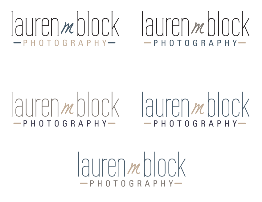
In the last round of revisions we applied different color variations of the chosen logo and color pallette.